Monopol-Online Relaunch
Design and Concept by Studio Last
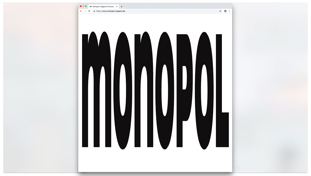
Immediately when accessing the home page the Monopol logo stretches high up, becomes indecipherable and energetically throws the visitor onto the overview of the website. It is the calculated use of movement—one moment surprisingly absurd, the next more subtly applied—that is used throughout the design as a leitmotif. It creates various rhythms and playfully draws the visitors’ attention towards the respective elements, such as the newsletter button. The accordion-effect that is specially designed for the overview highlights each image of the articles and allows a smooth navigation through the content.
The graphic design is characterized by the use of basic geometric shapes, a clear and simple structure, as well as the generous use of white space.
Pop meets formal stringency—that is how Matthias Last and his Berlin-based design practice Studio Last put their initial idea for the website’s redesign into words. Their aim was to create a news portal that brings together aesthetic playfulness with the objective approach of journalism.
Typeface: Ginto by DINAMO
Design + Art Direction: Studio Last
FB: facebook.com/studiolast.berlin
IG: studio.last


