Sans Sans
By MuirMcNeil
MuirMcNeil Sans Sans is an economical, robust and versatile sans serif type family. Its design is imprinted with the DNA of a number of protean sans serif typefaces from the latter half of the twentieth century, elegant late modern styles that are often referred to as ‘neo-grotesques.’ In developing this typeface, every contour, stroke, curve, and counter form has been honed to its most natural shape in order to render each individual glyph in the simplest, smoothest possible form.
Sans Sans is the initial outcome of a project that MuirMcNeil has been developing intermittently over several years. The project’s primary objective was to distil the latin alphabet into an organic system of archetypal components, not as an end in itself, but for subsequent use as the subject of a series of experiments investigating various rudimentary functions of typographic form such as legibility, symmetry, emphasis, rhythm, and frequency.
A starting point rather than a final conclusion, it was developed as a live specimen—a typographic genotype with potential for analysis, dissection, deformation and reformation into new visual organisms.
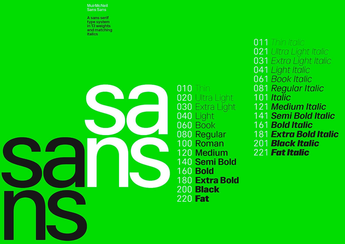
It is intended as an alternative to those contemporary typefaces that extend into a myriad of styles and subfamilies. It has been conceived as an unequivocal, distinctive design, drawn in two styles, upright and italic, each in 13 matching weights.
Sans Sans
Foundry: MuirMcNeil
Weights: 13 weights and matching italics
File Formats: OTF, TTF, WOFF & WOFF2
License: 1–5 users
Price: £ 260.–
BUY


