The Korean Lettering Workshop was designed by DAEKI and JUN to promote a design workshop organized by Center2Center (C2C). The poster features…
The client’s vision for a 200sqm dermatology clinic was resolute: neither a hyper-private boutique nor a mass-production factory. "I aim for a…
A human landscape connected by nature and bridges. Set upon a series of pebbles, a continuous line evokes the Han River flowing…
Observing Seoul's bustling streets, the artist felt disconnected from the city's authentic voice beneath layers of overwhelming noise. This project uncovers the…
A bookmark was designed to celebrate the second anniversary of the reopening of the Korean Film Council (KOFIC) Archive Library. By browsing…
The bookmark “Bookshelf” begins with writing on moving books and how their rearrangement reshapes the shelf. Letters carve inward to form walls…
This bookmark begins with the word “between.” The designer collected twelve words that include “between” in their dictionary definitions. The selection process…
This is a poster for an experiential exhibition, which invites participants to walk through a forest and record their smallest sounds and…
This archive book marks the 20th anniversary of Lee K-Dance. The publication adopts the exact format of the choreographer’s Moleskine notebooks, scanning…
SAN Memory is a decorative bold font that is soon-to-be variable. The type lies somewhere between slab serif and typewriter, while adding…
SAN Divine Comedy is a variable serif type that was inspired by merged ends distorting the type’s strokes due to ink smudge.…
SAN Sunday Sans is a variable sans serif type. The variable weight grows in and outward, resulting in a smaller negative space…
MOSP is derived from the Korean word “mosup,” meaning appearance or form. The identity explores how form is perceived and continuously reshaped…
We developed logo for Okdal, a Korean singer-songwriter duo. The symbol is inspired by a comma and a wink—a gentle gesture that…
LE SSERAFIM’s Antifragile visualizes strength that emerges through imperfection. The concept of becoming stronger by embracing one’s flaws is expressed through Kintsugi—a…
This book explores the role and possibilities of typography in the entertainment industry. It examines how typography works as a visual language…
RM’s Indigo visualizes youth not as a fixed image, but as a fluid and ever-changing state. Inspired by the way ink spreads…
Poster for the participatory exhibition “A Seat of Chance” by the art project team YAMS
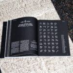
This photobook explores hidden properties of books that are invisible to the naked eye. Fifty books were selected based on their purchase…
Poster for installation artist Park Yuki’s solo exhibition Mea Maxima Culpa
Key visual and promotional materials for Songs of Liberation, Beautiful Korea. To mark the 80th anniversary of Liberation Day, the design reinterprets…
Graphic artwork for Salomon 2026 SS trail running collection, visualizing the moment when accumulated energy in the ground bursts and radiates outward.
Artwork for POVIDONE ORANGE, A.TRAIN’s third album, expresses social healing through the symbolism of povidone. Centered on consolation, empathy, and solidarity, it…
Graphic identity for the workshops and the final report exhibition of the 2025 Art Space Dugu Collective Project, ‘Minor Adjustments,’ organized by…
Upcoming Events
15.11.2026
Inside Aardman: Wallace & Gromit and Friends
Young V&A, London
14.04.2026 –
30.07.2026
45 Symbols—Clay to Code
Berlin, San Francisco, Vienna, São Paulo, Mexico City, Taipei, Bogotá, Johannesburg, Nairobi, Kyoto, Sydney
08.06.2026 –
17.07.2026
Summer Workshops Basel 2026
Hochschule für Gestaltung und Kunst FHNW, Basel
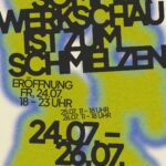
24.07.2026 –
26.07.2026
Werkschau Hochschule Bielefeld 2026
Bielefeld University of Applied Sciences and Arts, Faculty of Design and Art, Lampingstraße 3, 33615 Bielefeld