Fitness is not just physical, it is architectural. The Iron Culture series explores the raw geometry of discipline through brutalist typography and…
Fitness is not just physical, it is architectural. The Iron Culture series explores the raw geometry of discipline through brutalist typography and…
Creation of two jerseys for the french trail running brand Kinetik as part of their Design Lab. The design relies primarily on…
Colombici is a curated cycling holiday and travel company in Bogotá, Colombia, founded by Maya Blanco and Pan Yamboonruang, both passionate cyclists.…
Typography is central for the visual identity, not only for the logo system design but also for the printed materials and editorial…
For Hoopers PT’s 2022 summer clothing line, João Varela created a custom display typeface and a series of bold typographic compositions built…
Dunhill is a sans-serif and condensed typeface family mainly designed for headlines and large-size uses. Inspired by the aesthetic of football jersey…
Poster for the Zurich Sailing Club's annual Whitsun Regatta
Created to mark 150 years of Irish Rugby, the pitch itself became the starting point for the typography. Field markings and pitch…
Created for International Women’s Day 2022, six stamps celebrate Irish sporting icons. Their achievements stand alongside international sports icons, calling for a…
The jerseys were designed for the nationwide art school football tournament held in Münster in September 2026, and worn by ABK Stuttgart's…
This poster celebrates the enduring presence of women in sport. Through bold typography and dynamic athletic forms, it presents sport as a…
FC Petržalka Women rewrites club heritage through type. Engerau—the historic German name of Bratislava’s Petržalka borough and a long-standing club nickname—remains, but…
Custom lettering and logo illustrations for a lifestyle apparel extension by GOREWEAR®. Sticking to its roots in cycling but adding elements of…
FUCHEBOL is a display type family inspired by global football ephemera, retro jerseys, iconic players, and the sport’s cultural moments. From watching…
Green Ribbon Marathon has been rebranded as The Daily Sports Seoul Marathon—RUN SEOUL RUN. The new identity design draws inspiration from the…
How do you make a brand stand out in a market where everyone seems so serious? Maybe with a smile? For GÜDZ,…
MIRAGE is a sports eyewear brand inspired by the space between illusion and reality. A mirage is distant and untouchable, yet driven…
The challenge was to make a fishing brand desirable. Psycho Fins starts from this premise, looking at the sea with nostalgia without…
For those who live it, by those who live it. Qemp was born from what endurance cannot explain to those who only…
Total 69 is a retro sports font collection inspired by the golden era of football (the late 1990s to 2000s), from vintage…
What turns individuals into a community is what they share. In HOP’s rebranding, we turned Community of Consistency into a visual system.…
Hand made 24 page zine, about the brands identity through design. Self written poem illustrated with photographs and typographic elements
The work explores the relationship between typography and physical movement. Instead of designing letters as static forms, the alphabet emerges from traces…
Upcoming Events
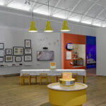
15.11.2026
Inside Aardman: Wallace & Gromit and Friends
Young V&A, London
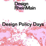
11.11.2026 –
14.11.2026
Design Policy Day
Frankfurt, Offenbach, Wiesbaden
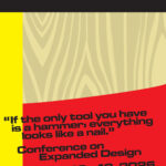
12.11.2026 –
13.11.2026
Conference on Expanded Design
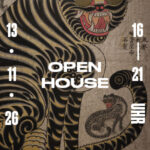
13.11.2026 –
13.11.2026
Slanted Open House / Seoul Release Party
Slanted Publishers, Nördliche Uferstraße 6, 76189 Karlsruhe, Germany