PORTO ROCHA refreshed Olympikus’s typographic identity, beginning with a sharper logo update—making the italic type more italic and the bold wordmark bolder.…
Created in 2025, The Court is an identity born from how basketball truly works: through the precise movements and tactical formations of…
AE CEALD DISPLAY is based on stacked blocks of ice. Its letters have rounded corners either at the bottom left or the…
AE CEALD DISPLAY is based on stacked blocks of ice. Its letters have rounded corners either at the bottom left or the…
NO FINISH LINE explores the underrepresentation of FLINTA* athletes in the media and aims to increase their visibility by bringing their stories…
VA FC is a Shanghai-based amateur football team whose members are mostly from artistic fields. Open to all genders, the team values…
AE CEALD DISPLAY is based on stacked blocks of ice. Its letters have rounded corners either at the bottom left or the…
AE CEALD DISPLAY is based on stacked blocks of ice. Its letters have rounded corners either at the bottom left or the…
AE CEALD DISPLAY is based on stacked blocks of ice. Its letters have rounded corners either at the bottom left or the…
Hailing from Marburg, Germany, our four-woman run club recently tackled our first 21-kilometer half marathon as a team. To celebrate this milestone,…
Creation of a typeface to add context to a statement sports jersey raising awareness for gun violence in the United States. As…
As the world demands relentless digital acceleration, the rider sheds the excess, merging into a singular entity with analog mechanics. Movement is…
The concept bridges sports drive and fan culture through bold, elemental shapes, merging energy and brewing into a seamless visual system. Just…
‚No stone unturned’ is about cobblestones, moving, turning and discovering. It is Canyon’s engineering philosophy behind the Endurace CFR, and it also…
Various badge designs created for the F/W 2018 season at adidas Originals. These illustrations were exploring the fine line between legibility and…
The poster explores running as a physical and mental journey, centered around the message “Keep Going.” The combination of vibrant orange and…
Custom numbers designed for adidas’s 2021 Creative Direction exhibition, revisiting the classic shirt numbers of the French national team.
A custom typeface designed for the Lionesses, England’s women’s national football team, for UEFA Women’s Euro 2025. Inspired by roses and thorns,…
Supergolf is a sharp, angular display typeface with no curves and a fixed cap height. Inspired by Cubist lettering from a 1926…
The brand’s 1990s aesthetic was revisited to create a modern, visually confident typeface that continues to represent this iconic running brand.
A custom typeface designed for the Netherlands national team ahead of the FIFA World Cup 2026. Inspired by classic Dutch typography, its…
For Tennis Club Locarno, +MAS type challenges the visual language of sport with a custom serif typeface. Sharp, claw-like serifs echo the…
A custom typeface created for Nike Football’s Norway project for UEFA Euro 2024. Inspired by Viking swords and the visual language of…
BBC Sport asked us to create a campaign identity that captured the raw power and physicality of the Six Nations. We built…
Upcoming Events

15.11.2026
Inside Aardman: Wallace & Gromit and Friends
Young V&A, London

11.11.2026 –
14.11.2026
Design Policy Day
Frankfurt, Offenbach, Wiesbaden
12.11.2026 –
13.11.2026
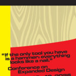
Conference on Expanded Design
13.11.2026 –
13.11.2026
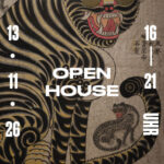
Slanted Open House / Seoul Release Party
Slanted Publishers, Nördliche Uferstraße 6, 76189 Karlsruhe, Germany