A custom typeface inspired by the movement and physicality of horse jumping, PJL Display and Sans are a dual-type system with DNA…
The Court is an identity born from how basketball truly works: through the precise movements and tactical formations of its players. To…
The poster captures the sensory essence of freediving through minimalist geometric tension. Distorted horizontal lines visualize ocean pressure and surface ripples bending…
A bead-based Arabic typographic exploration of “World Champion” translating the energy of sport into letterforms. Shifting type from purely digital into material…
Flow Forward is a triathlon team by Ryzon, Canyon and Zwift that celebrates the age-group athlete's journey rather than podiums. Its identity,…
Our research group at the Institute for Information Systems (iisys) analyzes the movements of surfers and skaters using 3D-Human-Pose-Estimation and visualizes the…
Fuoricampo is a display typeface rooted in Italian football and ultras culture. It explores the typography born inside the stadium, where lettering…
STEQZ, Slovakia’s National Teqball Association, turns the mechanics of a still-niche sport into type. Teqball is played with a size-five ball on…
GER BBALL / HELLAS was created for the German team competing at the basketball world championship 2026 in Corinth, Greece. At its…
Allure Running Club explores the visual language of running through typography, movement and repetition. Designed by Marie Chevalier, the identity turns pace,…
Allure Running Club explores the visual language of running through typography, movement and repetition. Designed by Marie Chevalier, the identity turns pace,…
Allure Running Club explores the visual language of running through typography, movement and repetition. Designed by Marie Chevalier, the identity turns pace,…
Fuoricampo is a display typeface rooted in Italian football and ultras culture. It explores the typography born inside the stadium, where lettering…
For the visual identity and spatial communication of QUEST Club, buero x-height uses Dinamo’s Gravity Variable to translate physical qualities into graphic…
Cycling is not only about speed. It is about everything in between: headwind and slipstream, cadence and repetition, acceleration and flow. The…
During the summer semester 2024 I explored outdoor swimming pools and developed a visual identity inspired by water wings, warning labels and…
Faster, Higher, Stronger.
Faster, Higher, Stronger.
FC Petržalka Women rewrites club heritage through type. Engerau—the historic German name of Bratislava’s Petržalka borough and a long-standing club nickname—remains, but…
A font with 603 KMH—top speed on the world’s fastest train—Transrapid The variable typeface Trans Rapid is designed from 2026 for the…
Seoul Marathon 2019 reimagines the visual language of a historic Korean marathon through a minimal graphic system. Moving away from familiar photographic…
Petanca is a history-rich sport that is celebrated by many people around the world whilst being an inclusive, easy-to-learn sport that knows…
In billiards, the eight ball is the one that ends the game. It cannot be rushed and it cannot be skipped: it…
METABOLIZING TIME AND SPACE examines St. Andrew’s Playground as a living environment shaped by time, movement, and interaction. Yura Kang translates its…
Upcoming Events
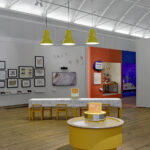
15.11.2026
Inside Aardman: Wallace & Gromit and Friends
Young V&A, London

11.11.2026 –
14.11.2026
Design Policy Day
Frankfurt, Offenbach, Wiesbaden
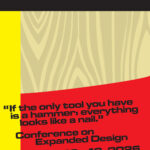
12.11.2026 –
13.11.2026
Conference on Expanded Design
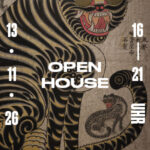
13.11.2026 –
13.11.2026
Slanted Open House / Seoul Release Party
Slanted Publishers, Nördliche Uferstraße 6, 76189 Karlsruhe, Germany